"The padding on this hero section is 24px, but the Figma says 48px. Also, the primary button is the wrong shade of blue."
Hero section padding mismatch — implementation uses 24px, design specifies 48px.
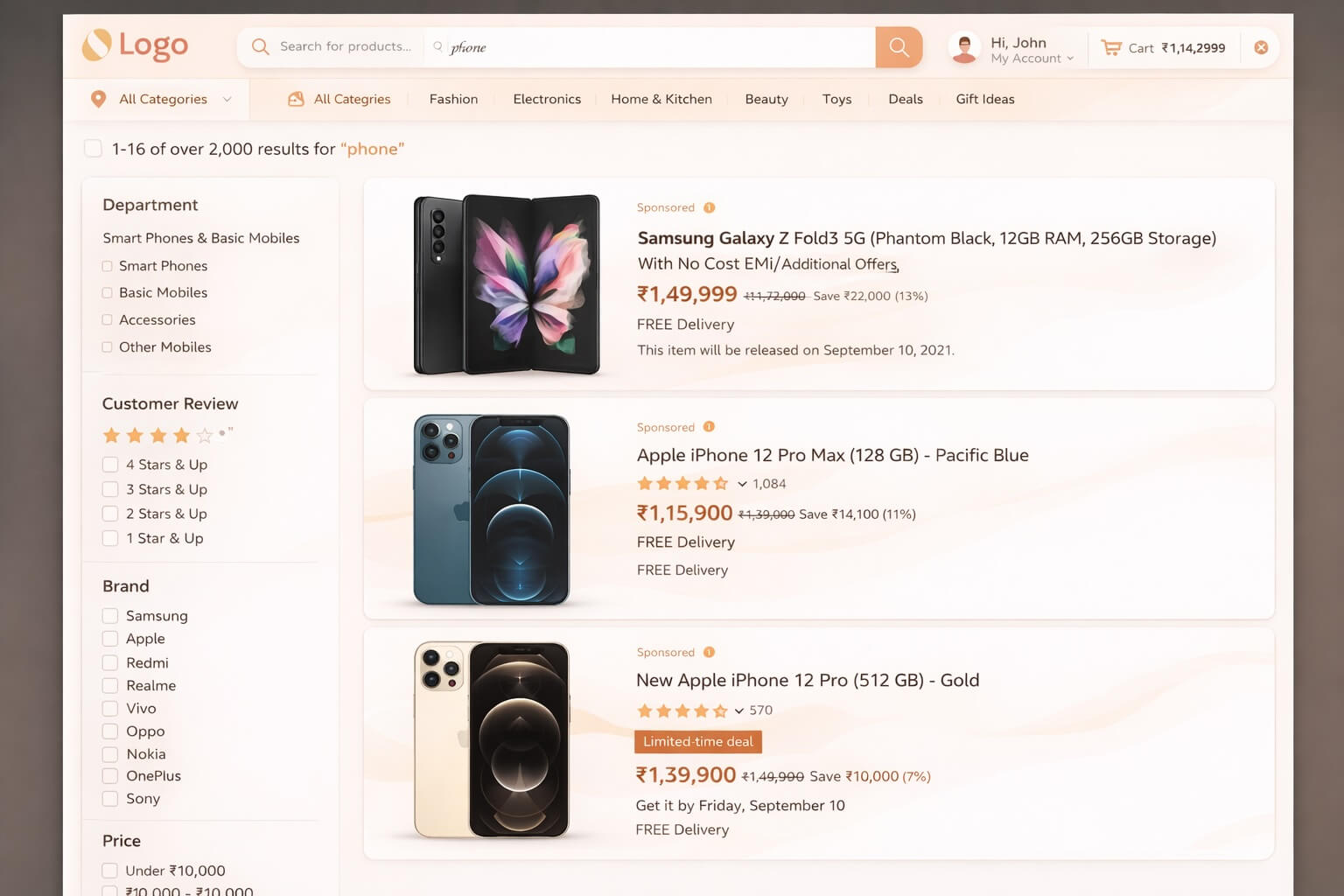
Primary button color is #3B82F6, design specifies #2563EB.
Font weight on CTA label is 500, design uses 600.
No extension required, but it's a superpower
Niriksa works fully in your browser — record, transcribe, and ship with zero installs. Add the Chrome extension and every session also captures the technical depth developers need.
Console logs
Errors and warnings captured as they happen. No copy-pasting from DevTools.
Network calls
Every request logged with status, URL, and timing. Spot 404s and 500s instantly.
User steps
Every click, scroll, and navigation recorded as a step-by-step reproduction trace.
How it works
Three simple steps from discovery to resolution.
Walk through the UI
Record your screen and explain visual or structural issues just as you would on a call with a colleague.
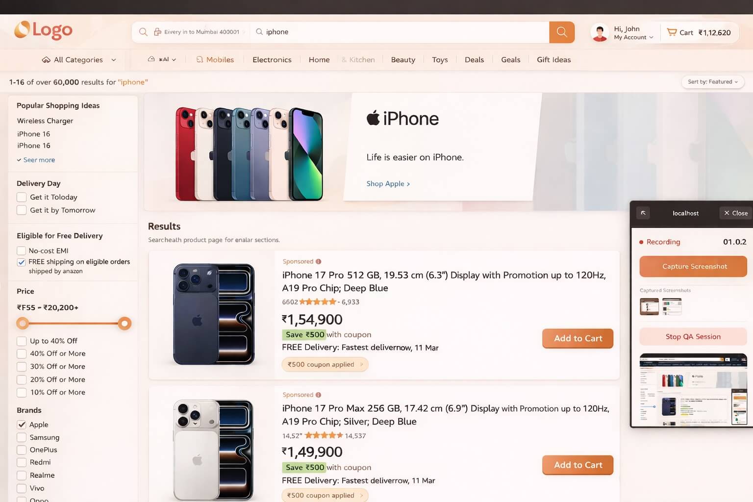
Visual Comparison
Niriksa captures exact visual evidence, isolating the differences between the implementation and your specs.
Auto-generate QC Report
Get a structured design QC report with screenshots, perfectly formatted to hand back to engineering.